The Student Life brand extension was created to complement and support the overall University brand while acknowledging the unique experience of the student after enrollment. While sharing many of the same motivations and perspectives as the prospective student, the enrolled student has entered a world where everyday life on campus offers opportunities to gain valuable skills alongside those learned in classes and form lasting relationships and memories that will stay with them for a lifetime. By adopting the brand extension, we can consistently present those opportunities as a proper realization of the promise we made when they enrolled.
Brand Guide
Adobe InDesign | Adobe Illustrator

WHAT WE ARE SAYING
How to use brand messages
We’ve crafted five brand messages—a key message and four supporting messages—to highlight the different facets of the Duquesne experience for all audiences.
The order of the four supporting messages isn’t hierarchical. Each one reflects a broad area of distinction for Duquesne or explains how what may seem like a basic requirement is lived distinctively here. Together, the five messages shape a compelling narrative that answers, “Why Duquesne?” In addition to the University-level brand messages, The Division of Student Life has additional, complementary message themes, which are explained on the following pages, and can be used in conjunction with the University brand message platform.
The role of messages is to provide a storytelling guide or checklist that ensures your story is distinctly Duquesne. You can repurpose this language if it works for you, or you can use it as a starting point—just be sure you retain an audience-centric perspective (prospective students, parents, donors, alumni, etc.) and a “you-focused” conversational tone.
These messages were developed based on research pulled from consulting with more than 7,300 individuals over two different studies, four years apart.

CONTENT DIRECTION
Speak directly—and with pride.
Duquesne has a long history of putting our heads down and “doing the work.” But students won’t know the amazing things happening here if we don’t tell them. It’s just as important once they’re here that students know the great opportunities that surround them on campus, too—and feel the enthusiasm of staff and fellow students committed to their success.
Give facts an emotional context.
Statistics are valuable storytelling tools, but they only become meaningful when they’re integrated into a larger story. Make sure you articulate why a stat or fact matters and why audiences should care.
Always start with “you”—literally or figuratively.
When prospective or current students feel seen, they develop a stronger and more immediate relationship with our brand.

HOW WE LOOK
Brand Color
Student Life’s brand extension elevates two colors already
within the overall University brand system to higher prominence. Pantone 299 (bright blue) and Pantone 192 (bright red) are the primary colors for this brand extension. These vibrant variations of blue and red add a sense of energy and youth to Student Life communications and should be used as core color options in most instances
The primary University brand colors (Pantone 280 blue and Pantone 200 red) can, and should, be used to accentuate design, as a visual tie to other University entities, and to maintain cohesiveness as required.
The primary typeface is Calibre.
This typeface provides a clean, clear, unified look across multiple platforms and should be used in the majority of communications. Especially useful in digital applications where size and clarity are essential, it is available in light, regular, medium, and bold weights. With Student Life applications, Calibre Black is the preferred, first option. Black and bold weights are used most often in headlines and subheads, and the light and regular weights are most often used in body copy.
Typography
The secondary typeface is the serif font Leitura News.
This serif font should be used for large to medium text applications for ease of readability. Not for large display or headline use, it is available in four weights.
The accent typeface is the decorative,
handwritten font Sayer Script.
Sayer Script was chosen to add a “personal touch” to type treatments, inferring a more casual, engaging experience in Student Life communications. Sayer Script should be used as an accent font in headlines and type treatments, but not in long lines of copy or copy blocks due to limited readability when used in abundance. The font provides three different weights to allow flexibility in application and production.
The Brand Extension contains multiple graphic elements special to the Division of Student Life. These elements are to aid in the energetic feeling of Student Life.
The Life on the Bluff and Duquesne University Traditions graphics can be broken down from the full lockup to the wordmark or icon variations. Each of these variations was developed for brand consistency, so they will exist in any-sized space.
The Life on the Bluff graphic should be used to represent Student Life-sponsored events. The Bluff content utilizes PMS 299 as the primary color and the Archway as the visual representation.
The Duquesne University Traditions should be used to represent University-sponsored events that happen yearly (ex., Homecoming or Light Up Night). The Traditions content utilizes PMS 192 as the primary color and the Duquesne Ring as the visual representation.
Along with the text graphics, there are several variations of silhouettes and campus landmarks for general design purposes
Graphic Elements


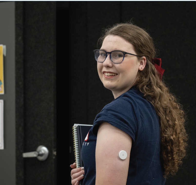
STUDENT STORY EXAMPLE
Hear From Hannah
Hannah Litke’s gratitude for teachers runs deep.
The early childhood education major and Spanish minor was diagnosed with type 1 diabetes in second grade. Not only did her teacher reach out to her parents to express concern about her symptoms pre-diagnosis, she made it easy and comfortable for Hannah to return to school following a hospital stay.
“That was really inspiring,” said Hannah. “I want my future students to have that same type of safe space in my classroom.”
Hannah is already creating safe spaces through “You Don’t Look Sick: The College Edition,” a podcast she developed for an Honors College fellowship project. The podcast covers the many ways disabilities can affect daily lives of college students and offers tips for navigating these challenges.
Hannah credits Director of Disability Services Tiana Brophy and her team with helping her adjust to campus life while managing diabetes.
“Duquesne’s Office of Disability Services is dedicated to supporting students with disabilities so they can succeed in their educational journey,” said Tiana. “We prioritize one-on-one meetings to learn about students’ individual needs and provide personalized support and accommodations to help them thrive.”
What’s next for Hannah as she approaches 13 years since her diagnosis? A 100-mile bike ride through Florida to raise funds for Breakthrough T1D, an organization that raises awareness and supports type 1 diabetes research.
#Duquesne #DuquesneUniversity #Pittsburgh #DuqGram